How to use the dashboard
What is the dashboard?
The ALI dashboard allows you to explore the results for yourself in a visual and interactive format. On each page, you can manipulate what is shown on charts, graphs, and tables, as well as filter and export the data.
Navigating the dashboard
To navigate to the dashboard, hover over ‘dashboard’ in the top menu, then select either the ‘executive summary’ or the ‘chart builder page’.
Once you are on a dashboard page, you can navigate to other pages by using the menu in the top right corner.
Simply click or tap the menu icon to open the menu, then navigate to a different dashboard page, or anywhere on the website.
Website menu

Dashboard menu

Using the toggle menu
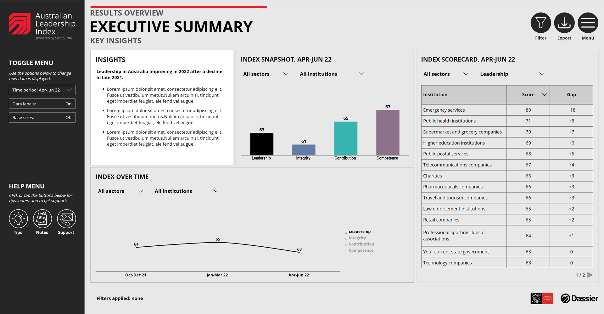
On each dashboard page, the toggle menu, located on the left side of the page, allows you to manipulate how data is displayed.
Using the different drop downs in the toggle menu, you can:
- Change the type of chart you would like to see on the page. Choose between a column, bar, or line chart.
- Change metrics. Easily switch between metrics such as leadership, integrity, contribution, and competence, as well as many others.
- Change data cuts. This changes the subgroups which are shown in charts, graphs or tables. For example, selecting gender in the ‘data cut’ drop down will display the data by gender sub-groups.
- Manipulate which time interval. Choose between month, quarter or year.
- Change the time period. Select specific months, quarters, or years.
- Turn data labels on or off. Some charts become a little cluttered with lots of numbers. You can turn these on and off by clicking or tapping on the data labels toggle. You can also hover over a data point with your mouse or tap on it to display a popup with all of the specific data points.
- Turn base sizes on or off. Do this if you would like to see the sample size for a specific data point.
- Access the tips popup. If you get stuck, you can click on the tips icon below the toggle menu for helpful hints on how to use various features on each page.
- Access the notes popup. The notes popup contains additional information around how data is collected, and the results seen on screen.
- Access the support popup. This popup provides information about how to get help with the data or dashboard.

Interacting with graphs
Alongside the toggle menu, you can also interact with charts and tables by:
- Hovering or tapping on the chart to see specific results. On each chart, you can hover over data points to see the results in a popup. This can be helpful if you have opted to turn data labels off in the toggle menu, or if there are many data series on the one chart.
- Turning data series on / off in time series charts. You can manipulate what is shown in a time series chart by clicking on the data series in the legend. As default, only one data series is shown on time series charts, allowing you to turn on additional data series to see specific results.
- Sorting data tables. Whenever a table is shown on a dashboard page, you can sort the table by clicking on each column heading. You can sort by any column in the table, in both ascending and descending order.
- Using drop downs. In some cases you can change metrics or data cuts for a specific tile. When this is possible, a drop down box will appear under the tile heading. To change the data displayed in the tile, click on the drop down and select your desired option.


Filtering the data
On some of dashboard pages, you can use the filter menu to filter the data.
To open the filter menu, click or tap on the filter icon in the top right corner of the page. Once the menu opens, there will be a number of filters to choose from.
Clicking or tapping on each filter will open a drop down, allowing you to select your desired options. For example, you could filter by a specific age group by dropping down the age filter, and selecting a specific group such as 18-24.
Once you have made your filter selection, click on the apply button in the bottom left corner of the filter menu to apply your filter.
You can change filters any time by re-opening the filter menu, clicking reset, choosing your next filter(s), and then clicking or tapping apply again.
Please note that applying lots of filters at the same time can result in low sample sizes, in which case data will not be displayed.

Sample size indicators
Filter information is shown at the bottom left of each page.
When a filter has been applied, the filter information on the bottom of the page will change, showing the specific filter that has been applied.
There are two warning indicators that you may see in the dashboard pages.
- Low sample size. If a specific data series has a sample of below 50 respondents, a yellow indicator will be shown next to the data series, along with a warning at the bottom of the page.
- Insufficient sample. If a specific data series has a sample of below 30 respondents, a red indicator will be shown next to the data series, along with a note at the bottom of the page. The data for the specific series will not be displayed on the chart, graph or table.

Exporting data
You can export the data that is shown on each dashboard page to either PDF or Excel format.
To export data, open the export menu by clicking on the export icon in the top right corner of the page.
Select the format you would like to export to, either PDF or Excel.
A dialogue box will open prompting you to save the exported file to your device. Select a location to save your file and then click save.
Please note that the PDF and Excel export will export the entire page, including the data cuts you have selected, and any filters you have applied.

Stay informed about leadership in Australia
Subscribe to the ALI to receive the monthly leadership newsletter and access our downloadable reports.
Subscribe